Why justified texts on the web don’t work well
When formatting content on the web, it often happens that we talk about text formatting: right, left or justified alignment?
How to format text on a website
Granted that you will find websites with justified texts and even some who, in their own web agency business pages or bloggers, will recommend it because they are more pleasant to read, we strongly advise against it and also explain why.
How to read text on the web
The web, the net, the Internet as it may be, is not the print media. It is, or at least should be, primarily usability.
The web is made to be found, to link content, to have in store
keywords
, links, materials to connect with each other.
On the Internet, text is generally not read in its entirety but rather is “scanned” for visual anchors to hold on to, usually headlines, bold words, links.
In the absence of these, the user skips ahead of the content, going in search of something more interesting, which he may not even find, thus closing the page and navigation to your site.

An example of how to do
For these reasons, it’s important to make it as easy as possible to find these visual landmarks.
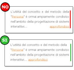
In the image above you will find a right and wrong example of text formatting.
Where is the error
The mistake was to use justified for text formatting thus eliminating any possible “visual anchor” and consequently decreasing readability.
Share on: